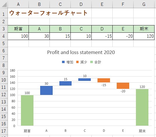
Excelによる

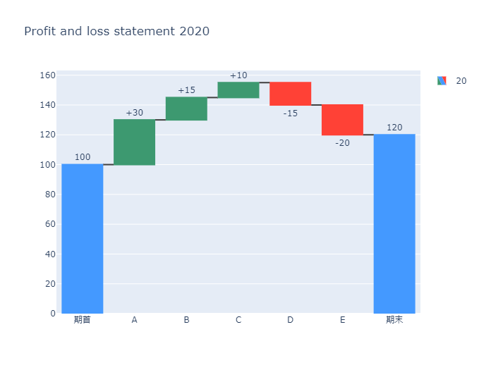
Pythonによる
import plotly.graph_objects as go

fig = go.Figure(go.Waterfall(
    name = "20", orientation = "v",
    measure = ["absolute","relative", "relative", "relative","relative", "relative", "total"],
    x = ["期首", "A", "B", "C", "D","E", "期末"],
    textposition = "outside",
    text = ["100","+30", "+15", "+10", "-15", "-20", "120"],
    y = [100, 30,15, 10, -15, -20, 120],
    connector = {"line":{"color":"rgb(63, 63, 63)"}},
))

fig.update_layout(
        title = "Profit and loss statement 2020",
        showlegend = True
)

fig.show()